I use a service called “Chart of the Day” – and as you might guess – they post one chart each day. I love preparing my own charts. But, I think the way I think. Sometimes, I get a new insight or perspective from how others see the market.
What follows is an example of a chart I wouldn’t have thought of myself. The second chart provides a little context and contrast.
The Dow Priced in Gold:
The Dow currently trades about 15% below its all-time record high. For some further perspective into how the stock market is actually performing, the chart below shows the Dow divided by the price of one ounce of gold.
This results in what is referred to as the Dow / Gold ratio or the cost of the Dow in ounces of gold. For example, it currently takes 12.9 ounces of gold to “buy the Dow.” This is considerably less that the 44.8 ounces back in the year 1999. When priced in that other world currency (gold), the Dow is in the midst of a massive eight year bear market!

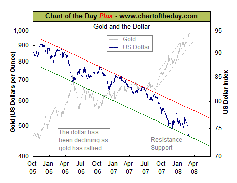
Gold versus the Dollar: Thanks in part to a large US trade deficit and a weak US economy, the US dollar continues to trend lower. For some perspective, the next chart illustrates the current trend in the US dollar (blue line) as well as that other world currency, gold (gray line). As this chart illustrates, the performance of the US dollar has varied inversely to that of gold since October 2005. It is worth noting that the US dollar is currently testing support.