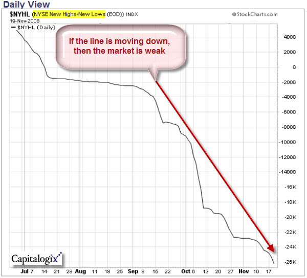
The market is weak right now. How do I know? Aside from the near-audible moan of the world's collective unconscious, price going down is a pretty good primary indicator. Kidding aside, other indicators are worth looking at here too. One of them is the NYSE High-Low line.
The following chart shows this market breadth indicator. It is calculated at
the end of each day by taking the number of NYSE stocks making New 52-week
Highs and subtracting the number of stocks making New
52-week Lows. What is important to notice is the shape of the line – up is strong (or
bullish), down is weak (or bearish). Sometimes a picture is worth a
thousand words.
You can view updated versions of this chart anytime on StockCharts.com at this link.
Advice For the Markets: Stop It!
So, what should the markets do next? At this point, humor seems appropriate. I saw this clip of Bob Newhart from Mad TV, last week, and it made me laugh.
Sometimes laughter is the best medicine.

