Impressive action in the markets this past week. While the markets climb a wall of worry, the bottom-line is that every time it has looked like a sell-off, recently, the market moves back up and punished the short-sellers.
I'm hearing talk of traders expecting a rally in the dollar. I take that as "code" that they are expecting a downwards correction for the general market, but have been wrong about the rally ending for long enough to call it something different.
Put me in that camp too. While I'm impressed by the strength and stamina this rally has shown, I am keeping a vigilant eye on the charts.
Here are three things that caught my eye this week.
1. Stocks Are Expensive Again.
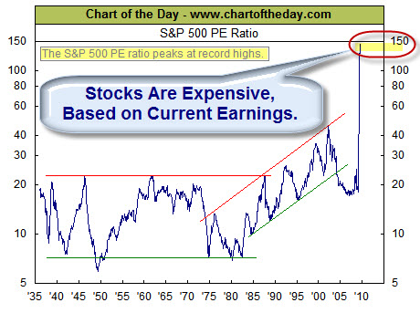
Perhaps because of the rosy picture the recent rally paints, few notice the plunge in S&P 500 earnings. The chart below, from Chart of the Day, illustrates how this plunge in earnings has impacted the current valuation of the stock market as measured by the price to earnings ratio (PE ratio).
Generally speaking, when the PE ratio is high, stocks are considered to be expensive. When the PE ratio is low, stocks are considered to be inexpensive. From 1936 into the late 1980s, the PE ratio tended to peak in the low 20s (red line) and trough somewhere around seven (green line). The price investors were willing to pay for a dollar of earnings increased during the dot-com boom (late 1990s) and the dot-com bust (early 2000s).
As a result of the recent plunge in earnings and the 5-month stock market rally, the PE ratio has spiked to 144 – a record high, and is currently at a still lofty 129.
Click here for a different perspective on the use of PE Ratios.
2. Declining Volume May Be Signaling Another Leg Up in the Rally.
I subscribe to Marty Chenard's StockTiming site. He often has an interesting perspective on what's happening. It is worth a look. This is straight from his site.
To really understand what the market is doing, one must observe many different sets of data. It is like a puzzle … it isn't until you have enough pieces fitted together that you can get an idea of what the picture is going to be. There are always key pieces that add especially critical information.
The stock market is no different … there is enough different kinds of available data for a person to drown in confusion. It is why focusing on smaller amounts of key data is important.
For instance … the amount of, and the trend of Declining Volume on the New York Stock Exchange can be a critical piece of data.
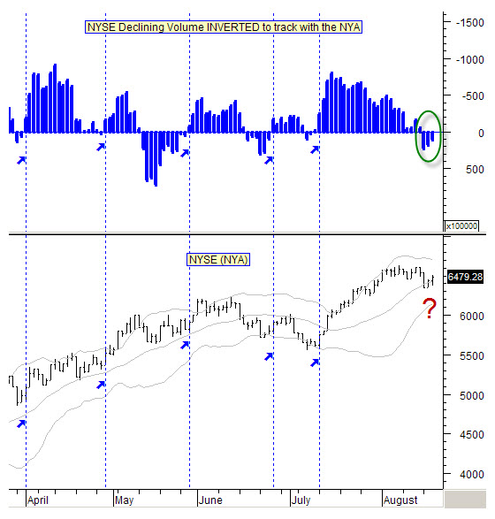
Take a look at today's chart which shows the Declining Volume of the NYSE. You know, that if Declining Volume is increasing, then it would make sense for the stock market to move lower.
So, in other words, they move opposite to each other. I always like to see charts where the information flows in the same direction, so we invert our Declining Volume charts.
In this way, we see the stock market's action relative to what the Declining Volume's action should be telling us about what to expect.
So here is our inverted, NYSE Declining Volume data chart. Take note of the vertical lines and how the NYSE's daily movements correlate with the Declining Volume's action. Pretty neat data, isn't it?
* Note: The data presented is as of the close this past Wednesday. Do notice, that although negative, the Declining Volume has been improving by decreasing during the past few days.
3. Wolfram Alpha Has Some Helpful Data for Traders.
Here is a screen capture from Wolfram Alpha's new stock comparison feature. This compares many things about the two companies; in this case IBM and Accenture. Obviously, you can compare other companies. This was just to give you an idea of what it can do for you.
I have been using Wolfram Alpha more recently. They keep adding new things; check it out.
Business Posts Moving the Markets that I Found Interesting This Week:
- Is Liquidity the New Volatility as a Timing Tool? (BigTrends)
- Professor Buffett's Tongue-in-Cheek Butterfly Effect Lesson. (Street)
- Are We in a Bull Market Yet? Why Technicians Say "No." (Barrons)
- U.S. to End Clunker Rebates This Week. (Reuters)
- In New Phase of Crisis, Securities Sink Banks. (WSJ)
- Starbucks Lowers Price Of Some Drinks To Stimulate Demand. (Reuters)
- More Posts Moving the Markets.
Lighter Ideas and Fun Links that I Found Interesting This Week
- How Technology Is Changing the Face of Innovation. (WSJ)
- IBM Uses DNA to Make Next-Gen Microchips. (Reuters)
- iPhone App Allows USAA Bank Check Deposits. (eWeek)
- Why Exercise Won't Make You Thin? (Time)
- The Art of Sprinting: In Business and Life. (Genius Catalyst)
- A New Look Inside Babies' Minds Reveals Much. (Time)
- More Posts with Lighter Ideas and Fun Links.


As mentioned earlier, Nifty will trade in 4600-5500 range throughout this year and its doing same only.
Now a days we can see many news in the market about various mergers and stake buying by Indian companies which is a good boost to Indian economy.
Still we strongly suggest everyone that one should trade with strict stoploss as Indian stock market is quite volatile.
Investors and traders should also remember one simple point in this Nifty swing from 4600-5500 they will get many good investment opportunities however they have to pick the right stock from so many NSE and BSE listed stocks.
Regards
SHARETIPSINFO TEAM