What do you think is the most bullish indicator of our markets? It's not a trick question; the answer is "price".
The markets have held-up nicely, throughout this rally, despite lots of bad news about the economy. And that, in-and-of-itself, is bullish.
It doesn't matter what technical analysis indicator you use (increasing negative divergences and selling on down days … or less positive momentum and market breadth), the markets have given us a clear message recently. Price is the primary indicator, and it has stayed above support.
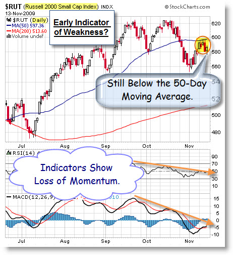
For example, here is a daily chart of the Russell 2000 Small-Cap Index. It is holding its gains; yet, sitting at a decision point.
Last week I posted a chart showing the Elliott Wave count of this index. Nothing in this chart changes that analysis.
We can't abandon the discipline of looking to technical analysis, just
because early indicators haven't tipped us off to the end of rally, yet. All that means is that the rally hasn't ended, yet.
The trading action during rallies is often characterized as "climbing a wall of worry". So, how long can this rally last? The next section suggests that a rally can last a lot longer than this one has, so far.
How Does This Rally Compare With Historical Rallies?
The Dow made another rally high this week, as it moved further above the 10,000 level.
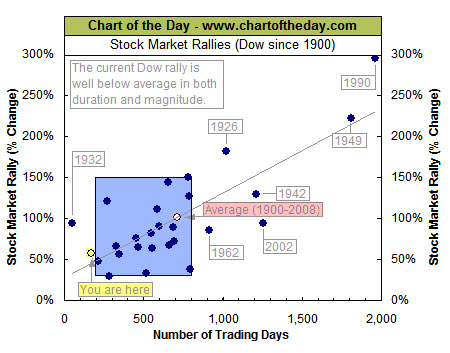
To provide some perspective to the current Dow rally that began back in March, all major market rallies of the last 109 years are plotted on the following chart from Chart of the Day.
- Each dot represents a major stock market rally as measured by the Dow.
- The Dow has begun a major rally 27 times over the past 109 years,
which equates to an average of one rally every four years. - Also, most major rallies (73%) resulted in a gain of between 30% and 150% (29.8% to 150.5% to be exact) and lasted between 200 and 800 trading days (9.5 months to 3.2 years).
- These "typical rallies" are highlighted in the blue-shaded box.
As it stands right now, the current Dow rally (noted with the yellow highlight) would be classified as both short in duration and below average in magnitude.
On a different, but related, topic … I think it's time to pay some attention to what's happening to the U.S. Dollar.
What Happened to the U.S. Dollar – Or … Why Is Everything Else Going Up?
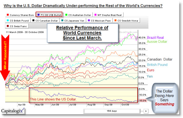
Here is a Performance Chart showing how the major world currencies have performed since last March. This chart made me think of the Sesame Street song "One of These Things is Not Like the Others". Notice that all the currencies, except the U.S. Dollar, are up since then.
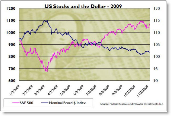
To me, this implies that the government made a decision near the March lows. Here is a link to an insightful post on why you should care about the strength of the dollar. In general, there is a strong inverse relationship between the strength of the U.S. Dollar and the strength of the U.S. Stock prices. Here is a chart showing what that looks like.
At some point, the economy will be more important than the market. To that end, U.S. Treasury Secretary Timothy Geithner said a strong dollar is in the nation’s
interest; and that the government recognizes the importance it plays to the
economic health of the United States and the global
financial system. We'll see.
Business Posts Moving the Markets that I Found Interesting This Week:
- Cisco's Profit Falls 19% – Shares Rise Anyway. (WSJ)
- Roubini: Bernanke Can Avoid A Crisis by … Actually He Can't. (BusinessInsider)
- Congressman Ron Paul Says Be Prepared for the Worst. (Forbes)
- Fed Sees No Need to Raise Rates Soon. (NYTimes)
- Buffett's Unusual Train of Thought on Burlington Northern. (WSJ)
- A VC Win: Greylock Partners Raised a $575MM new fund in six weeks. (WSJ)
- More Posts Moving the Markets.
Lighter Ideas and Fun Links that I Found Interesting This Week
- Moon Crash – While Public Yawns, Scientists Celebrate. (PhysOrg)
- Manhattan Providing Incubator Office Space for Businesses to Grow. (NYTimes)
- Learning in the Womb: Newborn Babies Cry in Native Tongue. (LiveScience)
- Hands-Free Parallel Parking in Your Next Car. (WSJ)
- Does Being Sad, or Complaining, Make You Smarter? (MarginalRevolution)
- Brain Scanners Can Tell What You're Thinking About. (NewScientist)
- More Posts with Lighter Ideas and Fun Links.


Howard,
I am reconstructing this comment from a few days ago when I lost all I had written when trying to post. Your chart of the Russell 2000 reminded me of Joe Granville’s theory that the small cap stocks always lead a bull market and the bull market is in place when the small cap prices continue to appreciate. I then went to charts of the Russell 2000, S&P Small Caps and the Dow Transportation Averages and observed lower highs and definite lower lows as shown in your $RUT chart. As the Dow Industrial Average and S&P 500 are making higher highs and higher lows there is a divergence in the trends of the Transportation averages and the small caps. This divergence in the the Dow averages is a red flag of caution and the divergence of the small caps is a double reg flag. I cannot share your bullish thesis. David http://dcorna.blogspot.com/