
Can a graphic that looks like a bowl of spaghetti help people understand a complex problem?
By now, you may have seen the “Afghanistan Stability” chart. It is raising questions about the amount of time and effort spent on slides like these … and their point of diminishing returns.
Isn't Lack of Thinking a Bigger Problem?
So, is using PowerPoint (or some other tool) really dangerous? Some claim it is because it can create the illusion of understanding and
the illusion of control. Here are some interesting commentaries about that from the NYTimes and the comments from FlowingData.
Do You Focus on the Process or the Result?
Working on a PowerPoint presentation, mind map, data visualization, or even a business plan … all have something in common. In many respects, the process is more important than the product.
When a chart (like the one below) is shown out-of-context, I wonder about its construction process. For example:
- Was it the work of one person, a group, or collection of sub-groups each working on a different part and then coming together to see how what they did fits with the rest?
- Was it based solely on one perspective, or did they come up with a reciprocal map that represents the other point of view … in order to come up with our plans?
- Was this map designed to stand alone, or was it background data for a different discussion (I noticed that the slide was numbered 22, and we don't know what came before (or after) it, or how many slides there were in that deck)?
OK, let's have some fun with the map.
The Afghanistan Stability Chart.
According to NBC News' Chief Foreign Correspondent, the goal in Afghanistan is to "convince militants to stop
fighting and to persuade Afghans sitting on the fence—those unsure
whether to back the Taliban or President Hamid Karzai’s government—to
throw their support behind the U.S.-backed government and its security
forces."
Fair enough … But if you want to know how we plan to
accomplish that feat, take a look at the large version of the military's
amazingly complicated schematic (from the Office of the Joint Chiefs of
Staff) which outlines the entire strategy. The chart, at least, is a
bit of a quagmire.
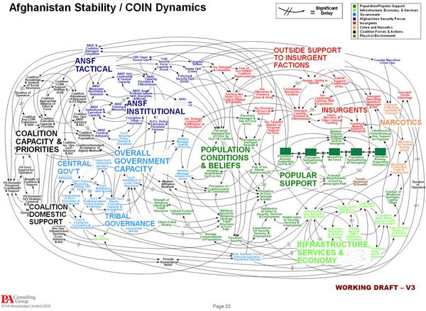
“When we understand that slide, we’ll have won the war,” a General joked.
Likewise, John Stewart has a few funny things to say on the subject.
| The Daily Show With Jon Stewart | Mon – Thurs 11p / 10c | |||
| Afghanistan Stability Chart | ||||
|
||||
![Reblog this post [with Zemanta]](http://img.zemanta.com/reblog_c.png?x-id=463e7f2d-e7bc-4ae7-a488-baf2a8d1f329)