
This week marked the first time that the S&P
500
Index had two up-days in a row since April 23rd. In contrast,
remember that
we used to be surprised about not having had two down-days in a row for an
extended period during the recent rally. Sometimes that is the nature
of this market – it
either has a relentless bid, or a relentless offer … and nothing in
between.
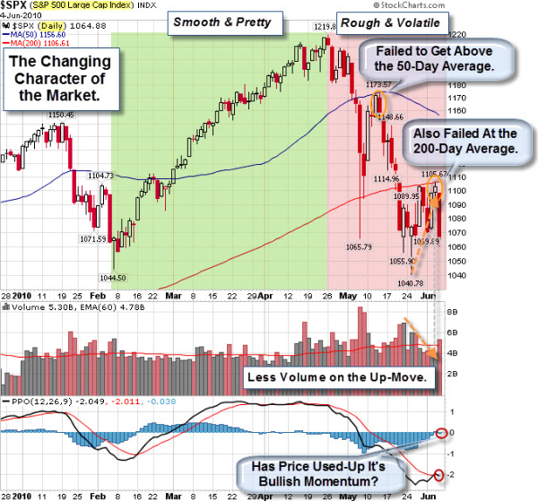
The Changing Character of the Market.
The chart below shows that things have, in fact, changed. The green-shaded area shows the smooth trend upwards on a daily chart of the S&P 500. The pink-shaded area shows where things changed. Moves became rougher and more volatile. The series of lower highs and lower lows indicates a trend shift downwards. Likewise, the failure to get back above the 50 or 200 day averages are bearish signs.
How Do You
Spell Volatility?
The move down hasn't been smooth on other
markets either. Since the beginning of May, the Dow Jones Industrial Average has made a
three-digit move in either direction on 17 out of 24 trading days. The
steepest loss over that period came on May 6, the day of the four-digit
“flash crash.” The biggest gain came just two trading days later, on May
10.
That trend continues; just this past Friday the Dow dropped 324 points, its second worst slide of the year. As a result, the index closed below 10,000 for the second time in two weeks.
We are not alone. Many world markets are suffering. For example, concerns about Hungary suffering a Greek-like crisis pounded the Euro to a four-year low.
Prechter Says: “Even $1 Trillion Can’t Save the Euro, But Gold is No Safe Haven”.
The euro’s recent loss has been the dollar’s gain, which means that it’s not the best time to buy the U.S. dollar. Meanwhile, the most popular alternative to currencies, gold, isn’t such a good buy either. Here is an excerpt from Robert Prechter’s interview with Yahoo! Finance Tech Ticker host Aaron Task to hear what Prechter thinks is in store for the U.S. currency and gold.
Labor Market on the Ropes.
May employment report was a sucker punch. On the surface, the Labor Department reported that nonfarm payrolls increased by 431,000. However, a deeper look shows that private-sector job growth was a mere 41,000 jobs … and 411,000 of the new positions were temporary census jobs.
I remember when this cartoon was an absurd commentary on big government. Now it is funny that we thought that would be enough to fix things.

This chart provides some perspective on the US job market. Note how the number of jobs steadily increased from 1961 to 2001 (top chart). During the last economic recovery, however, job growth was unable to get back up to its long-term trend (first time since 1961). More recently, nonfarm payrolls have pulled away from its 40-year trend (1961-2001) by a record percentage (bottom chart). In fact, the number of US jobs is currently at a level first reached in early 2000.

Business Posts Moving the
Markets that I Found Interesting This Week:
- The Perils of Volatility: From Over-Cautious to Under-Protected. (Barrons)
- Will the Finance Bill Help Tame Wall Street? (TheWeek)
- Financial Regulation Debate to be Public: June 24th is the target
date. (BankTech) - Euro Falls to Four-Year Low. (WSJ)
- Gold Daily Chart – Is That a Cup and
Handle Pattern Forming? (Jesse'sCafé Américain
) - More Posts
Moving the Markets.
Lighter Ideas and
Fun Links
that I Found Interesting This Week
- Days of Planning Led to Flotilla’s Hour of Chaos. (NYTimes)
- Enemies Can Be Good for a Child’s Social & Emotional Growth. (NYTimes)
- GPS's $8-Billion Upgrade: Accurate Within Arm's Length. (LATimes)
- The "Swinger" Takes Any Song and Makes it Swing. (MusicMachinery)
- Why Coffee Doesn't Work? Perhaps it's time to kick the habit? (TheWeek)
- More
Posts with Lighter Ideas and Fun Links.
![Reblog this post [with Zemanta]](http://img.zemanta.com/reblog_c.png?x-id=05e8f502-f90b-4d2d-8fed-d500c23e1aa9)