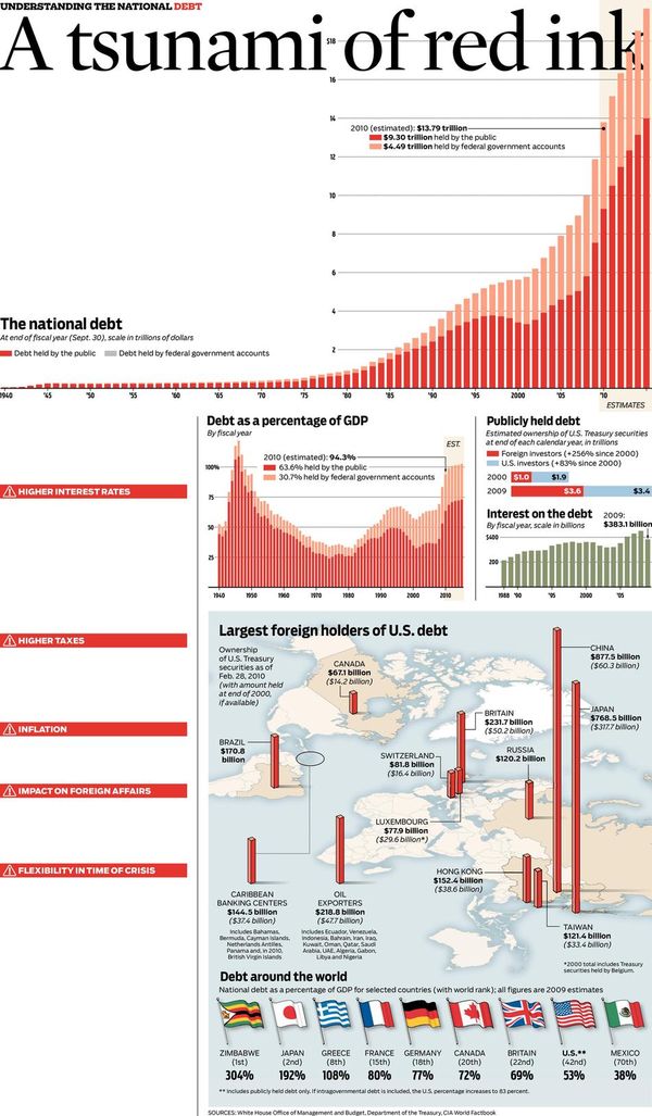
On the first day of June, the total U.S. public debt crossed the $13 trillion mark. In the 20 some days since then, it has already grown more than another $52 billion. The debt number is currently equal to just under 90 percent of the entire size of the U.S. economy.
The national debt is growing at $45,000 per second. That’s more than $5,000 more than the annual U.S. income per capita — every second.
Putting It In Perspective.
I was looking through some clippings I'd saved and a few of them caught
my eye.
The first is a graphic from the Chicago Tribune about understanding the National Debt. It speaks for itself.
How Big is a Trillion?
A Trillion is a hard concept to grasp. That is a million millions. Here are two videos that put the number in perspective.
The first is from Mint. It's official, Trillion is the new Billion. No longer is government spending talked about in terms of a mere ten digits. With the recent flurry of government spending, we are going to need another three zeros to make sense of it all. One trillion dollars is a number that few people can comprehend, let alone your standard nine digit calculator. So what does one trillion dollars look like?
The second video is from CNN. They ask a Temple University mathematics professor John Allen Paulos to explain how much $1 trillion actually is. The story notes Senate Republican Leader Mitch McConnell is correct when he says that if you spent $1 million per day starting in the year 0, you still would not have spent $1 trillion by 2009.


