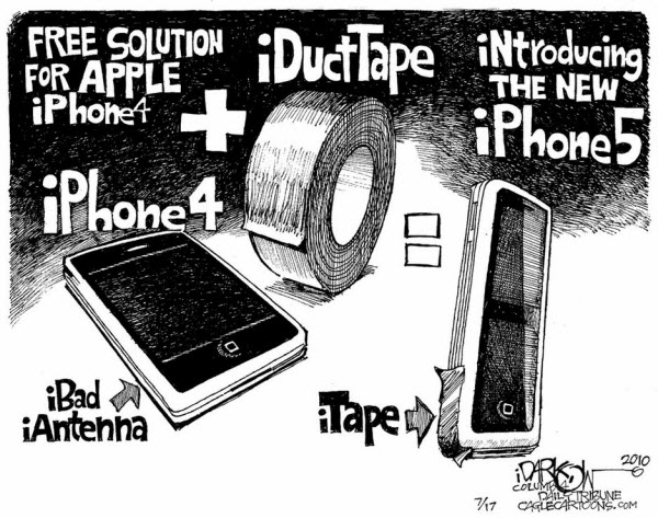
If only everything could be fixed this easily.
It is earnings season again. However, note that the year-to-year
comparison no longer refers to the recession. Instead, the comparisons
get harder than last year. Moreover, the economic data has been ugly … and so has sentiment on quarterly earnings. The question becomes: how tough will it be for Wall Street to battle back from the latest sell-off?
Market Commentary
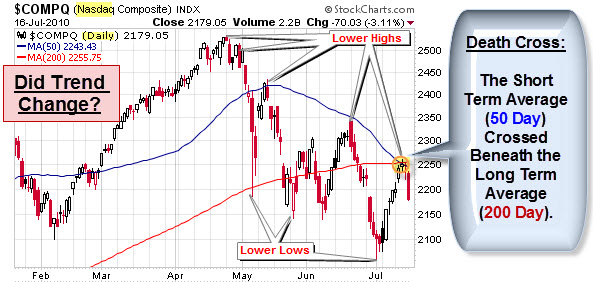
The chart below shows a daily view of the Nasdaq composite index since January. Note, however, that this market has been making lower highs and lower lows since April. That is the classic definition of a downtrend.
In addition, chart watchers often pay attention to a pattern called a Death Cross. This occurs when the short-term (50 day) moving average crosses beneath the longer-term (200 day) moving average. As you can see, a death cross happened last week. It is highlighted in yellow and circled in orange. Since then, the market has fallen further.
Is a Leading Indicator of Economic Activity Drying-Up?
If you are looking for insight into global
supply and demand trends, the Baltic Dry Index is one of the purest
leading indicators of economic activity. It
offers a real-time glimpse at global raw material and
infrastructure demand,
as well as the supply of ships available to move this type of cargo.
According to Bloomberg, Commodity shipping rates ended their
longest losing streak in almost
15 years on speculation owners are refusing to offer vessels at
current hire rates.

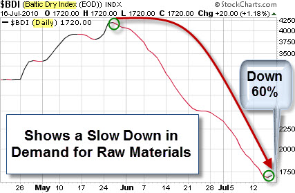
The index has had a particularly bad run of
35 consecutive drops, the longest since November 1995, during
which the measure lost 60 percent of its value. Since
making a short-term peak in late May (about a month after equity
markets peaked), the index has declined about 60%.
Just in case you wanted more fear fodder to chew on, Here is a chart that is making the rounds.
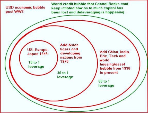
De-Leveraging the Credit Bubble.
It purports to show that the total leverage within the world financial system currently
stands at 60 to 1, where we are leveraged 60 to the 1 of real reserves
we actually have.
Christopher
Laird explains this chart as follows:
The point of emphasizing it's from
the end of WW2 is that we are not talking merely about a banking crisis,
or whatever. We are talking about the deleveraging of the greatest
economic/finance bubble in history. Once the level of leverage reached
60 to 1, it becomes impossible to stay ahead of the deleveraging, even
for central banks. The implications are staggering. Every major economy
in the world is involved. The outcomes of deleveraging this monster
bubble, represented by the green oval, will be what I term Credit Crisis
II. At 60 to 1 leverage, a loss of 1 to 2% wipes out the capital.
Let's hope that doesn't happen. On the other hand, there has been a lively debate about what the chart really means. For further insight on this, check-out the comment section on the Business Insider's
Chart of the Day post about this topic.
Business Posts Moving the
Markets that I Found Interesting This Week:
- Ten Reasons to Be Bullish & One BIG Reason to Be Bearish. (TradersNarrative)
- Behavioral Finance’s Smoking Gun: Probability Analysis Isn't
Rationality. (PsyFi) - Jumping Back Into Bonds: Investing With an Eye on Absolute Return. (WSJ)
- Insane Bulls And Bears – or – The Men Who Want to Be Roubini. (Forbes)
- Mao Zedong's Creation, Agricultural Bank of China Raises $19 Billion
in I.P.O. (NYTimes) - More Posts
Moving the Markets.
Lighter Ideas and
Fun Links
that I Found Interesting This Week
- Four Styles to Consider When Constructing your Innovation Portfolio.
(BizWeek) - Clear and Present Danger – The Increasing Threat of Cyber-Attacks
& Hackers. (Wharton) - Google Voice Officially Launches To The Public. (LATimes)
- Apple Studies User Downloads to Hone Mobile Ads and Take-On Google. (BusinessWeek)
- Picking Our Brains: How Strong is the Mind-Body Link? (NewScientist)
- More
Posts with Lighter Ideas and Fun Links.


