Tracking the Hindenburg Omen: How Much Danger Is There?
 "Friday the 13th" got a little scarier than normal as warnings were heard from many corners of the financial blogosphere that the Hindenburg Omen triggered.
What is it? It is a fairly obscure technical analysis pattern, which supposedly gives an early warning of unstable market conditions (and even potentially stock market crashes).
While the calculation is based on five factors, the primary conditions indicate that there is a big disagreement about market conditions.
For example, two of the conditions are that a substantial number of stocks have to be at yearly highs, while a substantial number of stocks have to be at new annual lows. Ultimately, it is hard for those two conditions to be met in a short period of time, unless there's uncertainty in the market. Moreover, after a rally, uncertainty is often a precursor to a decline.
In addition, technically (in order for the pattern to be complete), a second sighting of the five elements must occur within 36 days. Logically, lingering uncertainty is a momentum killer.
While this pattern has correctly predicted every big stock market swoon of the past two decades, including the October 2008 decline (that set the global economic recession into motion), not every Hindenburg Omen has been followed by a crash. Resorting to a geometry analogy: All rectangles are squares, but not all squares are rectangles.
Personally, I don't make trade decisions based solely on indicators like this. Nonetheless, it has a pretty good track record, seems to be based on reasonable theories, and might be useful as just another data point urging caution.
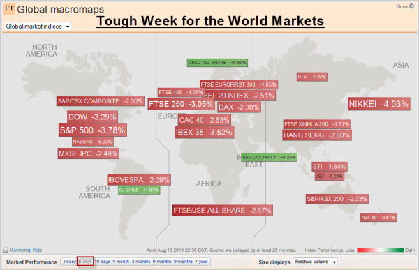
Tough Week for World Markets.
Taking a macro view, many markets around the world went down last week. Notably, the NASDAQ was down 5%, the Nikkei was down 4%, and many other indices were down 3%.
Here in America, the Federal Reserve’s Open Market Committee startled financial markets by raising its terror alert level over the economy and declaring it would keep buying bonds to maintain its loose-money stance and fight deflation. Despite the promise of help, the markets continued lower.
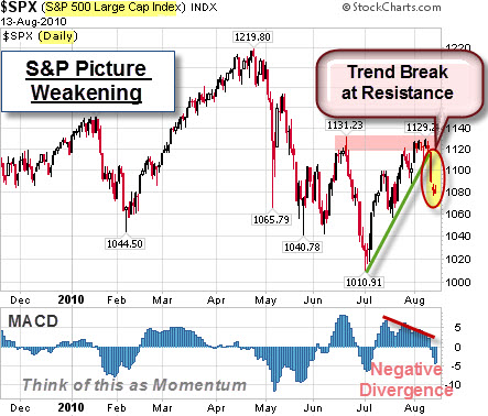
Let's Look at a Chart of the S&P.
What does a daily chart of the S&P 500 Index show? Price has retreated from the resistance area (marked by the pink highlight). In addition, price has gapped below the up-trend line (marked by the green line). Combine that with a negative divergence in MACD momentum, and the picture is technically weaker than before.
Bulls are looking for an oversold rally. Bears are looking at the unfilled gaps as breakaway gaps.
As always, it should be interesting.
Business Posts Moving the Markets that I Found Interesting This Week:
- Goldman Had 10 Days of Trading Losses in Q2. (WallSt&Tech)
- The Options Market's Take On H-P: Frenzied Buying in Put Options. (Barrons)
- Grand Tetons Possibly for Sale: Governor of Wyoming Says They Are Desperate. (Alternet)
- How Far Should Google Go to Profit From the Data It Has About People's Activities? (WSJ)
- Skype Files Plans for $100 Million IPO. (WSJ)
Lighter Ideas and Fun Links that I Found Interesting This Week
- Hedge Fund Predicts "Apple Will Sell 50 Million iPads A Year". (BusinessInsider)
- Swarm Intelligence: Why Mimicking the Behaviour of Ants & Bees Is Smart. (Economist)
- What Your Appetite Reveals About How Your Brain Works? (PsychologyToday)
- BlackBerrys & Encryption – Spies, Secrets and Smart-Phones. (Economist)
- Google Goggles Lets You Search the Web With Your Mobile Phone Images. (Kurzweil)


