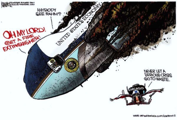
What does it mean when the President's chief enforcer bails?
Rahm Emanuel, President Obama's chief of staff, quit to run for Chicago mayor. Peter Rouse, a senior aide, takes Emanuel's position. Rouse, was Obama's chief of staff when he was a U.S. senator from Illinois. Saturday Night Live wasted no time putting its spin on the situation.
Likewise, Obama's finance guru and Treasury Secretary, Larry Summers, recently resigned. Do you think either of these moves will materially affect the market?
Market Commentary
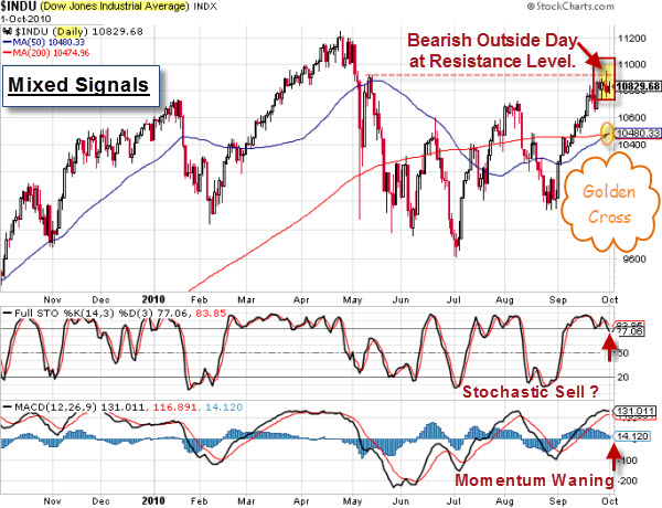
The Dow Jones Industrial Average is experiencing a "golden cross". That means the 50-day moving average crosses above the 200-day moving average at the same time that both moving averages are rising. This will be the first "golden cross" that the Dow has seen since December 1st, 2005.

So, how bullish is that pattern? While the "golden cross" is thought of as a positive technical indicator, the historical numbers tell a different story.
Also dampening bullish spirits, the market indices put in a classic bearish outside reversal day last week. That means price starts high, but closes near the low of the day. This pattern is often seen near market tops. It occurred right at the resistance level from the May highs, with the market relatively overbought. While MACD shows waning momentum, don't let a pop higher here surprise you.
Have You Looked at the U.S. Dollar Recently?
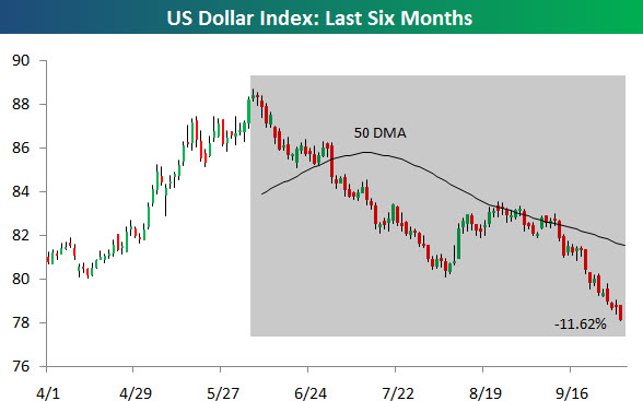
The third quarter was a boon for stocks, but it was a bust for the US dollar. Since peaking on June 7th, the US Dollar Index has pretty much gone straight down for a decline of 11.62%. Here is a chart.
Meanwhile, the price of Gold is soaring. And gold is arguably the least biased form of money. Consequently, many consider it to be the ultimate store of wealth (and hence, a good measure of relative value).
So, When Is Up Not Really Up?
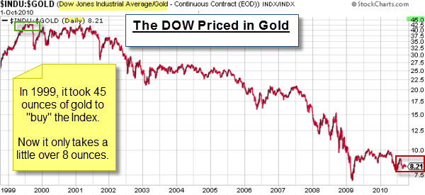
Why isn't the world beating a path to our markets, driving-up prices and volume? Perhaps because they don't see our market the same way we do. This next chart caught my eye because it shows our big rally (since early 2009) is less than a 10% rally (when it is measured in Gold instead of Dollars).

The Dow/Gold Ratio chart shows the ratio of the price of the Dow to the price of gold. Another way to look at it is the number of ounces of gold it takes to buy one share of the Dow. For example, with the Dow at 10,000 and gold at $1,000, it would require 10 ounces of gold to buy one share of the Dow; so the ratio would be 10. The chart shows that at the recent market lows it took 7.5 ounces, and now it takes 8.21 ounces of gold to buy the Dow.
This chart highlights one reason that a weak dollar matters. While the Dow is much higher in dollar terms, it is still declining when priced in Gold. This indicates that the strength we have seen is more a function of a weaker dollar rather than a real increase from real demand.
Business Posts Moving the Markets that I Found Interesting This Week:
- Did One Bad Trade Cause the Flash Crash? (Economist & SEC)
- Lots of Tech Mergers Is A Positive Sign – Who Is Next? (Forbes)
- Facebook's IPO Likely In Late 2012. (Reuters)
- Is China's Growth Sustainable, Or Are Strains Showing? (TheWeek)
- 10 Habits of Mind for Investors. (Big Picture)
Lighter Ideas and Fun Links that I Found Interesting This Week


