The Markets are in rarefied territory.
Have you been waiting around to "buy the dip" on this latest stock market rally?
If so, you have been waiting a long time.
The Dow and the S&P 500 surpassed their all-time highs.
How Strong is the Up-Trend?
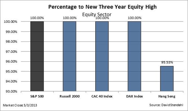
The chart below compares equity markets to their three year highs. Thus, if a market is
shown to be at 100%, then it's currently at a new three year equity
high. If not, then the percentage number indicates how close it is to
reaching a new equity high.
Looks pretty strong, globally; doesn't it?
Also visit the Drawdowns Metric page to view historic equity high watermark charts.
Does the economic, valuation, and political background support the budding euphoria? It just doesn't matter. Traders know that when Markets go up on bad news … that is bullish.
No Pull-Backs to Speak Of – That is Bullish Too.
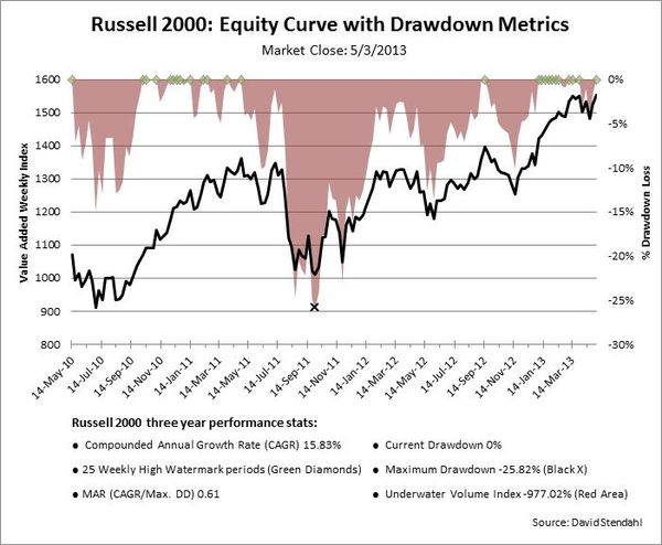
Risk can be defined in many ways … the two Russell 2000 charts below focus on a variety of drawdown risk measures that provide prospective on past risk and potential opportunity.
The Russell 2000, shown as a black line in each chart, is making new highs. In the chart below, the pink curve, shows the draw-downs from prior high water marks. The green diamonds (at the zero line) show new highs. This chart shows the past three years.
Drawdown Definitions
- Current Drawdown: Open loss since last underwater equity high.
- Maximum Drawdown: Largest peak-to-valley loss.
- Underwater Volume Index: Accumulation of all drawdown periods.
- MAR: A ratio that compares Reward, defined as Compounded Annual Growth Rate (CAGR)
to Risk, defined as Maximum Drawdown.
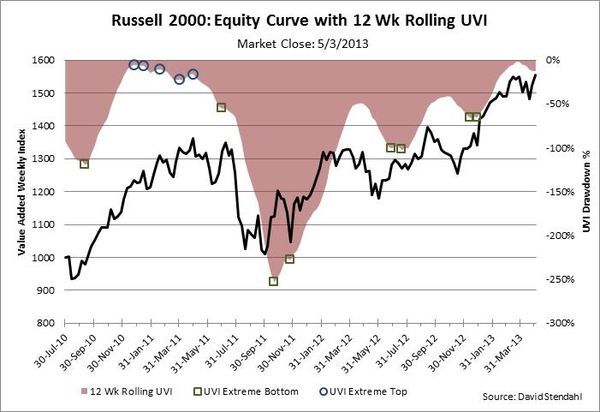
To get a different perspective, the next chart smoothes the Under-Water Index (drawdown curve), by taking a twelve week moving average of it. It is a good way to identify potential turning points for the Russell 2000.
The Blue circles and Green squares signify possible tops and bottom for the market.
One of the ways to use the rolling UVI chart is as a longer-term trend based indicator by watching the general direction of the UVI. If it's moving higher we might expect bullish systems to fare better, while if it's trending lower we might look for bearish systems to trade more effectively.
Right now there is a negative divergence. It is underwater while the market makes new highs. This is where buying should come in … if not, then this is an early warning.
To see this indicator on other markets, click here.
The Trend is your friend … until it isn't. But that is pretty easy to tell based on support and resistance levels and indicators like this. Till then, enjoy it while you've got it.


Thank you so much for the wonderful information.This is really important for me.I am searching this kind of information from a long time and finally got it.