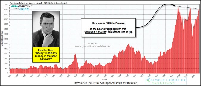
This chart displays the price of the Dow going all the way back to 1885 — and adjusts it for inflation. Clearly, if you do that, it is lower now than it was 13-years ago.
via Global Financial Data via Kimble Charting.
But, does the series of lower highs (marked at the far right of the chart) imply a meaningful technical analysis resistance level? Moreover, can you safely infer that the Dow is 'struggling' with that level? I don't think so.
Technical analysis is supposed to help you understand, and respond intelligently, to what is happening in the market. This pattern seems more coincidental, rather than causal.
Support and resistance zones supposedly reflect meaningful price points where a genuine disagreement between the Bulls and Bears is contested. I doubt this pattern was caused by Traders making big bets based on inflation-adjusted charts.
Consequently, I view this as interesting, but not tradeable, information … What about you?


