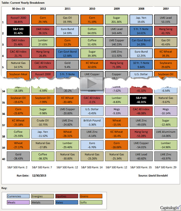
The chart shows the top-and-bottom performing markets, ranked by yearly performance.
The data is color coded based on sector. The first column shows 2013 performance, followed by six columns of the most recent yearly market performances.
Click this link to view weekly, monthly, quarterly, and yearly views of this data.
So, how does that compare to other markets around the world? Here is an interactive chart to answer that question.


