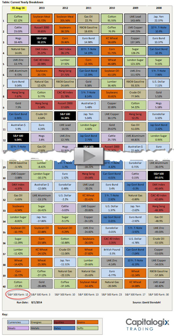
There is always something working. It still surprises me how often it changes.
For example, take a look at Coffee's rise.
The chart below shows the top-and-bottom performing markets so far this year. The data is color coded based on sector. The first column shows year-to-date performance, followed by six columns of the most recent yearly market performances.
Click the image to jump to the full chart.
Click this link to view weekly, monthly, quarterly, and yearly views of this data.
So, how does that compare to other markets around the world? Here is an interactive chart to answer that question.

