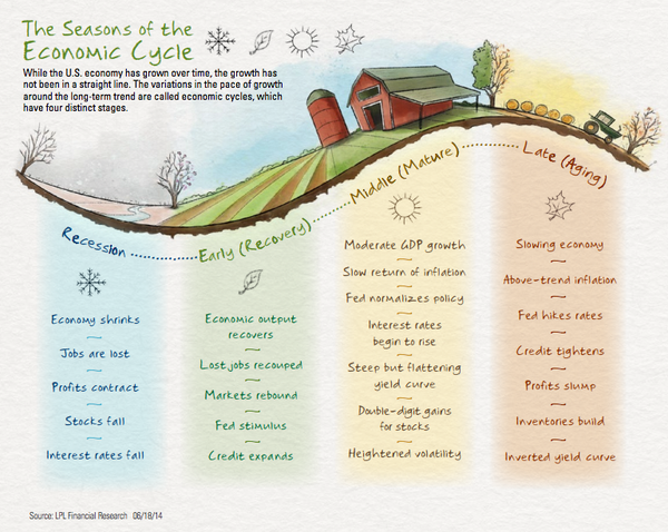
Just re-looked at this chart depicting the four seasons of our basic economic cycle.
Pretty clear where we are.
LPL Mid-Year Outlook via Josh Brown.
I like maps (like this one) because they help you anticipate, rather than simply react to what happens.

