At this point, the S&P 500 is up over 200% from its March 2009 low.
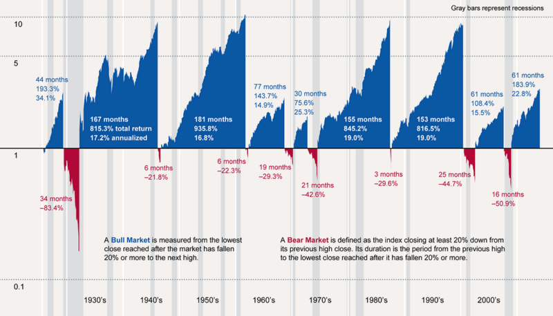
This bull market has lasted 68 months, which seems like a long time … until you compare it to the length and strength of other bull runs.
This chart shows the history of Bull and Bear Markets in the U.S.
via @jerrykerns.
The blue areas represent past bull market durations and returns (total and annualized). The red areas represent past bear markets.
Note: this chart is a little dated – it was originally published in May.
Nonetheless, it is a good reminder of the bigger picture.

