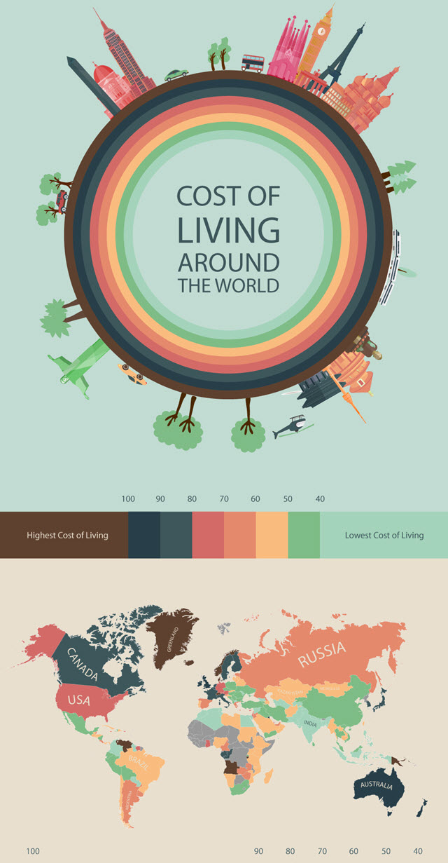
This map shows the difference in living costs around the world using figures from the world's largest database of user contributed data about cities and countries worldwide.
The Consumer Price Index, used to determine the difference in the living costs between countries, takes into account the prices of groceries, transportation, restaurants and utilities.
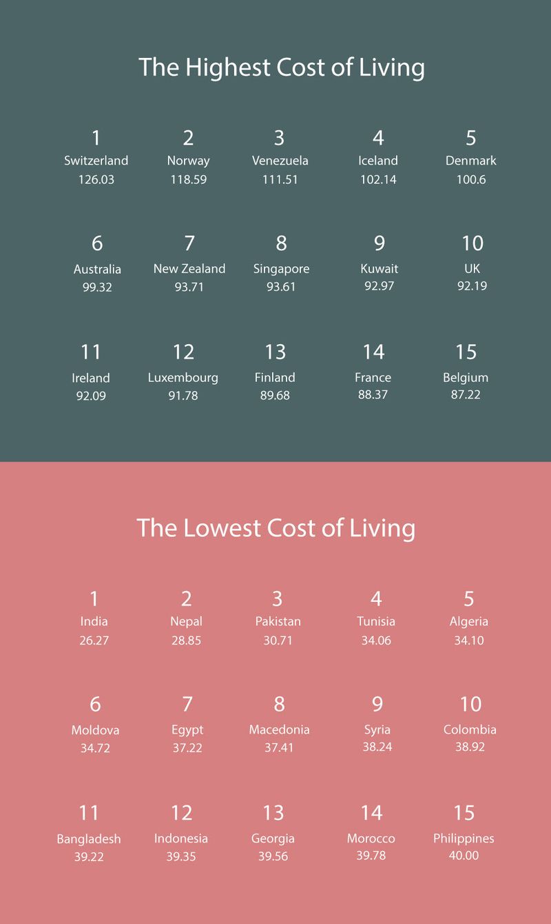
There are many more charts with specific data by region. The chart below shows the places with the highest and lowest costs of living.
via MoveHub.
The CPI in the infographic is a relative indicator of a country's living costs compared to New York. So, for instance, if a country has a CPI of 70, on average it enjoys 30% cheaper living costs compared to New York.


