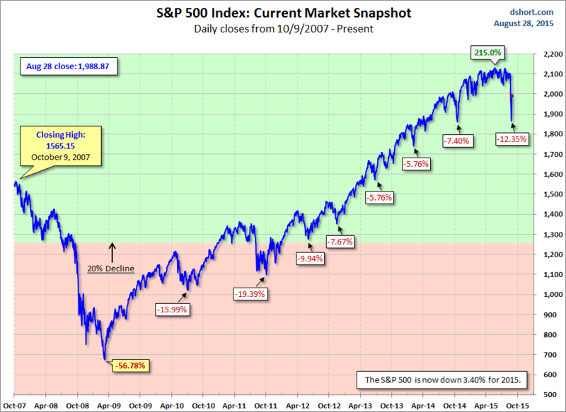
How bad was the recent decline? It was the biggest since 2011.
To put it in better perspective, here is a chart (based on daily closes) showing significant S&P 500 Index declines since the all-time high prior to the 2008 Bear Market.
The area with the pink background highlights the "Bear Market" area beyond the 20% decline mark.
via Doug Short, Advisor Perspectives.
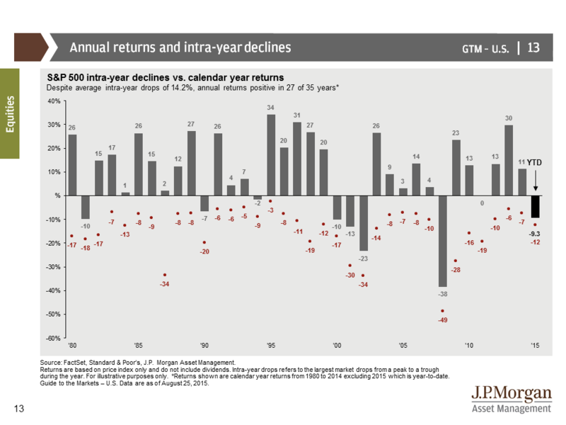
Buy and Hold investors must stomach significant drawdowns to get their returns — even in 'good' years.
The chart below shows S&P 500 intra-year declines compared with calendar year returns. The bars represent year-end returns since 1980, while the reddish dots mark each year's market low.
via JPMorgan Guide to the Markets.
According to Business Insider, here are the historical frequencies of certain market correction levels.
Since 1900, we've seen:
- 5% market corrections: 3x per year.
- 10% market corrections: Once per year.
- 20% market corrections: Once every 3.5 years.
The point is that 10-15% pull-backs are normal (and perhaps even healthy) for the market.
Interesting.


