There has been a lot of news lately about global markets … and how something that happens in one affects the others.
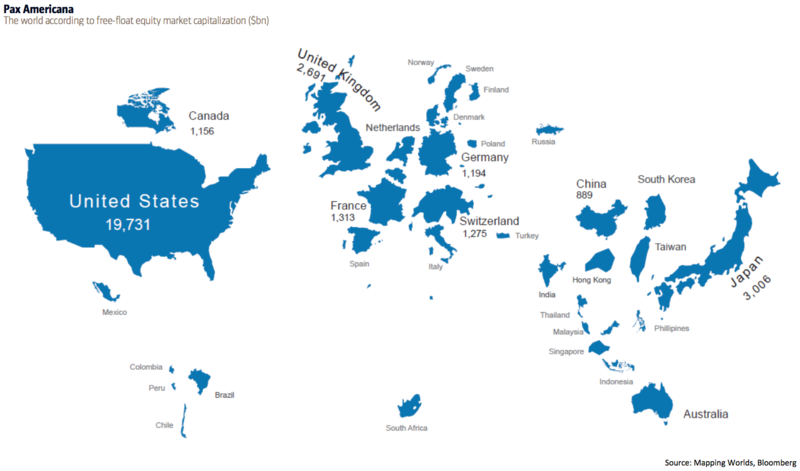
This chart is interesting because it puts the world's markets in a different perspective.
It shows the world according to free-float equity market capitalization in billions of dollars measured by the MSCI.
From BofAML’s Transforming World Atlas.
The US, with a market cap of $19.8 trillion, is the biggest and represents 52% of the world's market cap. Japan is in second place at $3 trillion, followed by the UK at $2.7 trillion, and then France at $1.3 trillion.
Notably, Hong Kong's market cap is nearly the same size of China (both of which are significantly smaller than countries like the US and Japan).
Meanwhile, Russia, which has a bigger surface area than Pluto, is about the same size as Finland in terms of market cap.
Interesting.

