It isn't hard to predict the number of 18-year-olds in 2030. You start by counting the 3-year-olds today.
Likewise, certain huge macro-economic forces are easy to see.
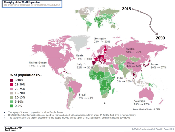
The chart below shows the aging of the World's population. The small image at the top shows the current snapshot. The larger image shows the world in 2050.
via BofAML.
Countries with a low birth to death ratio will continue to get older and suffer the consequences of attempting to pay for the care of the many through the efforts of the few.
Based on this, you can start to get a sense of where the more promising emerging markets will come from.

