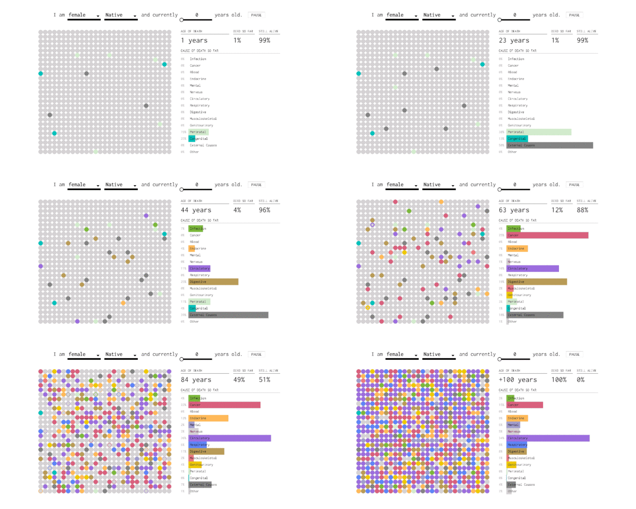
Flowing Data has previously visualized when we'll die and how our loved ones will die. Now, they have put together an interactive infographic that charts out how you will likely die, based on how many years you've lived.
via Flowing Data.
Here's how it works: go to the infographic on the Flowing Data page and enter your sex, race, and age into the blanks at the top of the infographic. On the left side, each dot represents the death of a simulated self, and the color of each dot corresponds to a cause of death (infection, cancer, circulatory problems, external causes, etc.). As each year passes, more of your simulated selves die. On the right side, a bar graph keeps tabs on your cumulative percentages. When the animation ends (at year 100), you're left with the percent likelihood that you will die of each cause.
It's an interesting way to visualize the data because it shows not only your chances of dying from a certain disease but your likelihood of dying in general during certain phases of your life.
The results have one pretty obvious takeaway—your chances of dying increase as you age—but it's fascinating to watch how the chances change in different age groups. Shift the age to 0, and you'll see that once you get past year one, the dots accumulate slowly over the next few decades (chances of death, from anything, are low). Past 30, the dots change color more quickly (you get the point).
Ultimately, we all have to go one way or another.
Let's just hope it is later.

