There is always something working in the Markets. It still surprises me how often it changes.
A look at the recent winners and losers (based on year-end performance) shows the volatility and varied nature of this list.
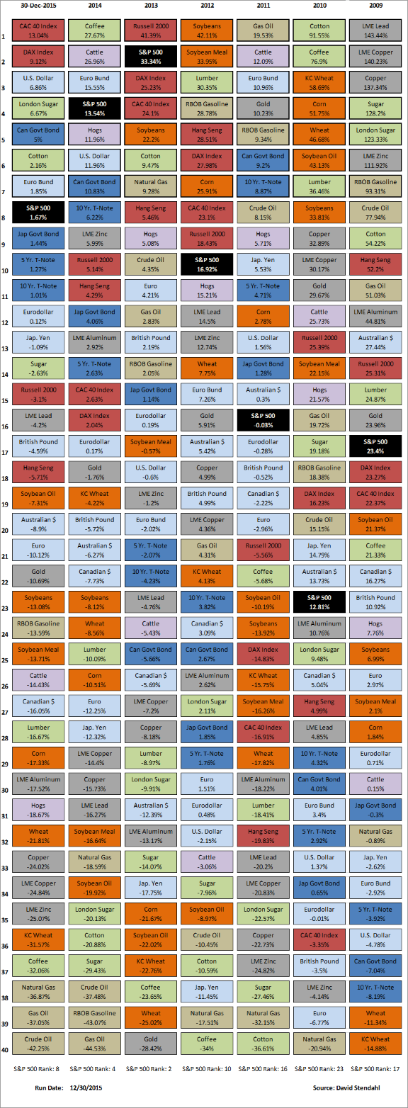
Who would have guessed the big winners this year would be the French and German markets, along with the U.S. Dollar.
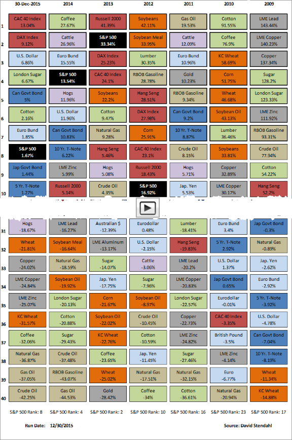
The chart below shows the top-and-bottom performing markets for the year. The data is color coded based on sector. The first column shows 2015 performance, followed by six columns of the most recent prior yearly market performances.
Click the image to jump to the full chart.
Table Key:
Note: The S&P 500 Index is shown in black to highlight its performance vs other markets that offer an equity portfolio full diversification.
Click this link to view weekly, monthly, quarterly, and yearly views of this data.
So, how did the U.S market compare to other markets around the world? Here is an interactive chart showing how the S&P 500 out-performed this past year.


